Book Design: A Century Downtown
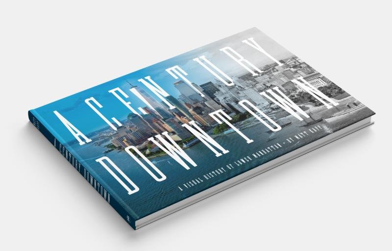
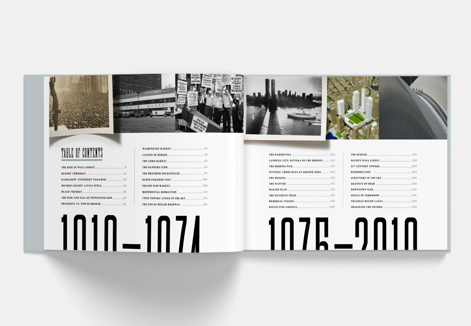
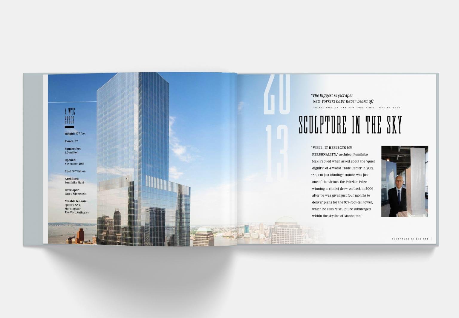
One of my favorite (and largest) recent projects was to design a coffee table book titled A Century Downtown: A Visual History of Lower Manhattan. The book was conceived and written by former Vanity Fair colleague Matt Kapp. Matt co-produced the award winning documentary 16 Acres on the history of post-9/11 lower Manhattan and is a true expert in this area. Naturally, the structure of the book is chronological so I wanted to create a design system that would be linear, modern, and also compliment the stunning archival images. I chose a condensed slab font named Blakey (designed by Matt Willey) as the primary typeface. The boldness and condensed style of this typeface allowed for some very dynamic shifts in scale and contrast on the pages. In researching a visual direction for the book, I had honed in on vintage NYC transit signage and this typeface fit that reference point perfectly. I created a grid and design system of shared elements to give each chapter consistency, prominently show the years, and also provide the flexibility to reflect the aesthetic of each period of history. The book is beautifully written and researched with hundreds of photos that tell a complete story of a remarkable history. Designing each chapter and poring over the historic photos was an amazing experience. The book took over two years to produce and I'm very proud of the final product.